
Behind Vindictive.
A closer look at how we think, design and build.
Scroll to open
Vindictive Studios
2026
Version 1.0 — October 2026
Behind the brand
Identity · Principles · Design · Development
Introduction
This guide describes how Vindictive Studios looks, sounds and feels. It exists so that everything we do, from a proposal to a launch, feels like the same studio.
What it is
A shared foundation for our identity: logo, colours, typography, graphic elements and how we write.
Why
A brand is built in the details. When every surface follows the same rules, the studio feels bigger, more reassuring and more considered than the sum of its parts.
How to use it
Use the guide when you design, write or produce material for Vindictive. If you are unsure, choose the simpler option and ask us.
01 / The studio
Who we are.
Vindictive is a founder-led design and development studio run by Joel and Christian, both full-stack engineers.
We design and build everything ourselves, from websites to software and apps, and you work directly with us from the first call to launch.
- founders, both full-stack engineers
- 2
- middlemen between you and the people building it
- 0
- ways to work with us
- 3
Our positioning
We design digital experiences. We engineer what powers them.
Premium websites, custom software, mobile apps and development expertise for ambitious businesses.
You talk to the people building it.
02 / Principles
What we believe in.
Four principles guide how we design, build and talk to clients. They are also the yardstick for anything new we make.
01
No middlemen
No sales reps or project managers in between. The same people design it, build it and answer your emails.
02
Clear and simple
Fixed prices, clear steps and no weeks of back and forth before anything gets built.
03
Design with character
Websites and products that turn your brand into a better digital experience, not another template.
04
Built to last
Everything we build should be able to grow: fast, accessible and easy to develop further as your business changes.
03 / What we build
Three ways to work with us.
Buy a website package online, build a product with us or bring our engineers into your team. The same people design it, build it and answer your emails.
Distinctive websites that turn your brand into a better digital experience.
Websites and online stores with design at the centre. Fixed-price packages you buy online.
From first prototype to production-ready software.
Web apps, SaaS, MVPs and mobile apps – new ones, or further development of existing ones.
The engineering capacity you need, without building a team from scratch.
Engineers for your team when you need them, and white-label development for agencies.

Arkitektdesign, one of the sites we built
04 / Voice and tone
We write the way we talk.
We write the way we talk to a client on a first call: direct, personal and free of agency speak.
The scales show where our voice sits between two extremes. The voice is the same everywhere, but the tone can shift a little between a proposal and a social media post.
Tone of voice
- Formal to Personal: closer to Personal
- Salesy to Factual: closer to Factual
- Technical to Clear: closer to Clear
- Cautious to Confident: closer to Confident
- Playful to Serious: closer to Playful
- Wordy to Concise: closer to Concise
How we sound.
Direct
We say what we mean in as few words as possible. Short sentences and concrete promises.
“Fixed price. Clear steps. No surprises.”
Personal
We write as “we” and talk to the reader as “you”. People build things, not an agency.
“You talk to the people building it.”
Confident
We know what we’re doing and don’t need to exaggerate it. No superlatives, no buzzwords.
“Have something ambitious in mind? Let’s build it.”
We avoid:
Groundbreaking end-to-end solutionsWe say: Discuss a project
We avoid:
We take your brand to the next levelWe say: We’ll come back with questions and a proposal
We avoid:
Synergies and best practiceWe say: The same people design and build
We avoid:
Contact our sales departmentWe say: A fixed price you buy online
05 / The mark
Four nodes. One flow.
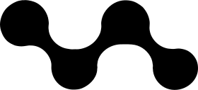
The mark is four nodes joined in one unbroken line, like an idea moving from sketch through design and code to launch. It is how we work, in one shape: design and engineering in the same flow.
The mark can stand alone when space is tight or the sender is already clear, for example as a favicon, app icon or profile picture.
Idea → Design → Code → Launch
Primary logo
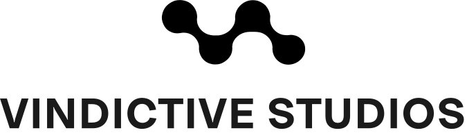
The stacked logo is our primary signature. The mark sits centred above the wordmark VINDICTIVE STUDIOS, set in Uxum Bold capitals with light tracking. The logo is never redrawn: always use the original file.
Clear space and minimum size
The clear space around the logo is at least x, where x is the diameter of one node in the mark. Nothing else – text, image or edge – may enter the zone.
Minimum size
- Mark, digital
- 24 px
- Mark, print
- 8 mm
- Logo, digital
- 120 px
- Logo, print
- 30 mm
Below 120 px wide, the mark is used on its own, without the wordmark.
06 / Colour
Primary palette.
The palette comes from the website: a dark night sky, bone-white text and a warm glow as the accent. The names in brackets are the tokens in the code.
| Colour | HEX | RGB | CMYK |
|---|---|---|---|
| Night(night) | 1 7 26 | 96 73 0 90 | |
| Deep(deep) | 7 14 38 | 82 63 0 85 | |
| Glow(brand) | 226 154 95 | 0 32 58 11 | |
| Bone(bone) | 236 239 244 | 3 2 0 4 | |
| Fog(fog) | 139 147 167 | 17 12 0 35 | |
| Soft glow(brand-soft) | 240 181 133 | 0 25 45 6 |
Click a colour to copy its HEX. CMYK values are converted from RGB and should be proofed before larger print runs.
Logo colours and gradients.
The mark comes in more colours than the web palette. Use them for the mark and the logo, for example in print, profile pictures and covers, but not as surface colours in layouts.
Marin
#223948 · RGB 34 57 72
Sand
#AC987F · RGB 172 152 127
Sunset · #F9B745 → #CB2D43
Roséguld · Five stops: #FFDBCB · #DAA197 · #99655C · #FFC9BF · #C68E85
On light backgrounds

Marin — #223948
Black — #000000

Sunset — Gradient
On dark backgrounds

Sand — #AC987F

White — #FFFFFF

Roséguld — Gradient
07 / Typography
Uxum.
Uxum Grotesque · 3 weights
Browser fallback: ui-sans-serif, system-ui, sans-serif
Large headings, quotes and figures.
Uxum Grotesque is our only typeface. It is used for headings, body text and interfaces, on the web and in print. One family is enough: contrast comes from size and weight, not from more typefaces.
Type scale
The sizes come from the website’s scale, based on Bringhurst: 14 · 16 · 18 · 21 · 24 · 36 · 48 · 60 · 72+. Headings are tightly tracked, body text gets room to breathe.
Display XLLight · 116 px · 0.95 · −3.5%
Let’s build it.
Display LGLight · 76 px · 1 · −3%
Premium websites
Display MDLight · 52 px · 1.05 · −2.5%
Digital products
HeadingRegular · 24 px · 1.2 · −1%
Three ways to work with us
LeadRegular · 21 px · 1.55
Fixed price, a small team and no middlemen.
BodyRegular · 16–17 px · 1.6–1.75
We design and build everything ourselves, from websites to software and apps.
LabelBold · 11–12 px · +20% tracking
Start your project
Display sizes are scaled down to fit the page.
08 / Graphics and motion
Graphic elements.
The starfield
Small points of varying brightness give depth to dark surfaces, as on the website. Used on covers and section pages, never behind body text.
Nodes and lines
The mark’s nodes can be broken out into processes, timelines and diagrams: points joined by a line.
Hairlines
Content is divided by thin lines in bone white at 10% opacity. No heavy borders or shadows.
The curve cubic-bezier(0.16, 1, 0.3, 1): fast start, soft landing
Motion
Animations start fast and land softly. Always respect the user’s reduced-motion setting.
09 / In practice
Applications.
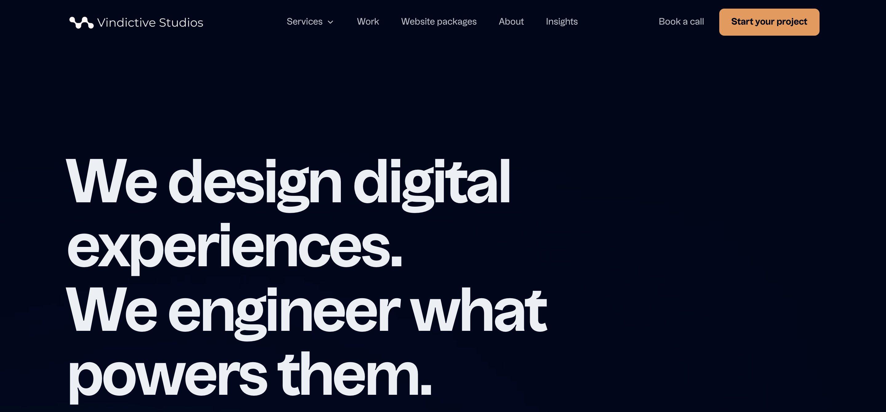
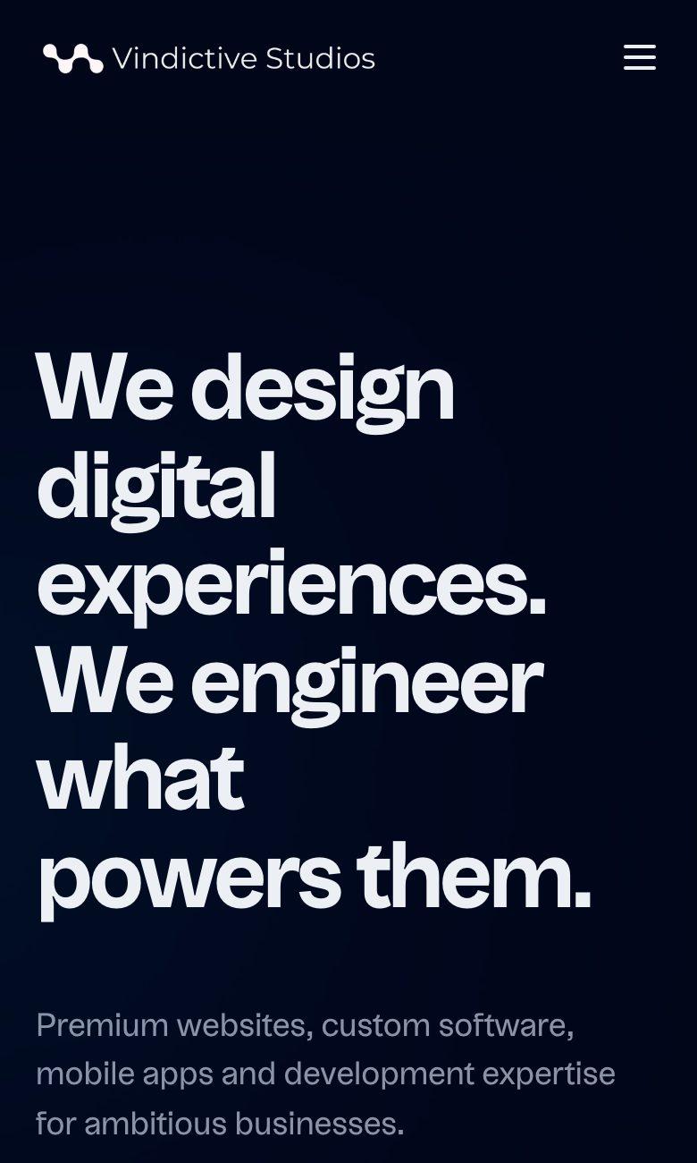
Website
Have something ambitious in mind? Let’s build it.
vindictive-studios.se
Social media
Joel
Founder, full-stack engineer
hello@vindictive-studios.se
vindictive-studios.se
Business card, front and back
Christian
Partner, full-stack engineer, Vindictive Studios
vindictive-studios.se
Email signature