
Experience
Arbetsförmedlingen
A component and documentation in a public design system
- Role
- Frontend/UX Engineer
- Period
- Jan–May 2025
- Team
- Design team
- Status
- Published
The design system at Arbetsförmedlingen, the Swedish Public Employment Service, holds the components, colours and guidelines the agency’s digital services are built on. From January to May 2025, Joel was a Frontend/UX Engineer in the design team and built the quote component digi-quote with its documentation page, and the Webbfärger (web colours) page.
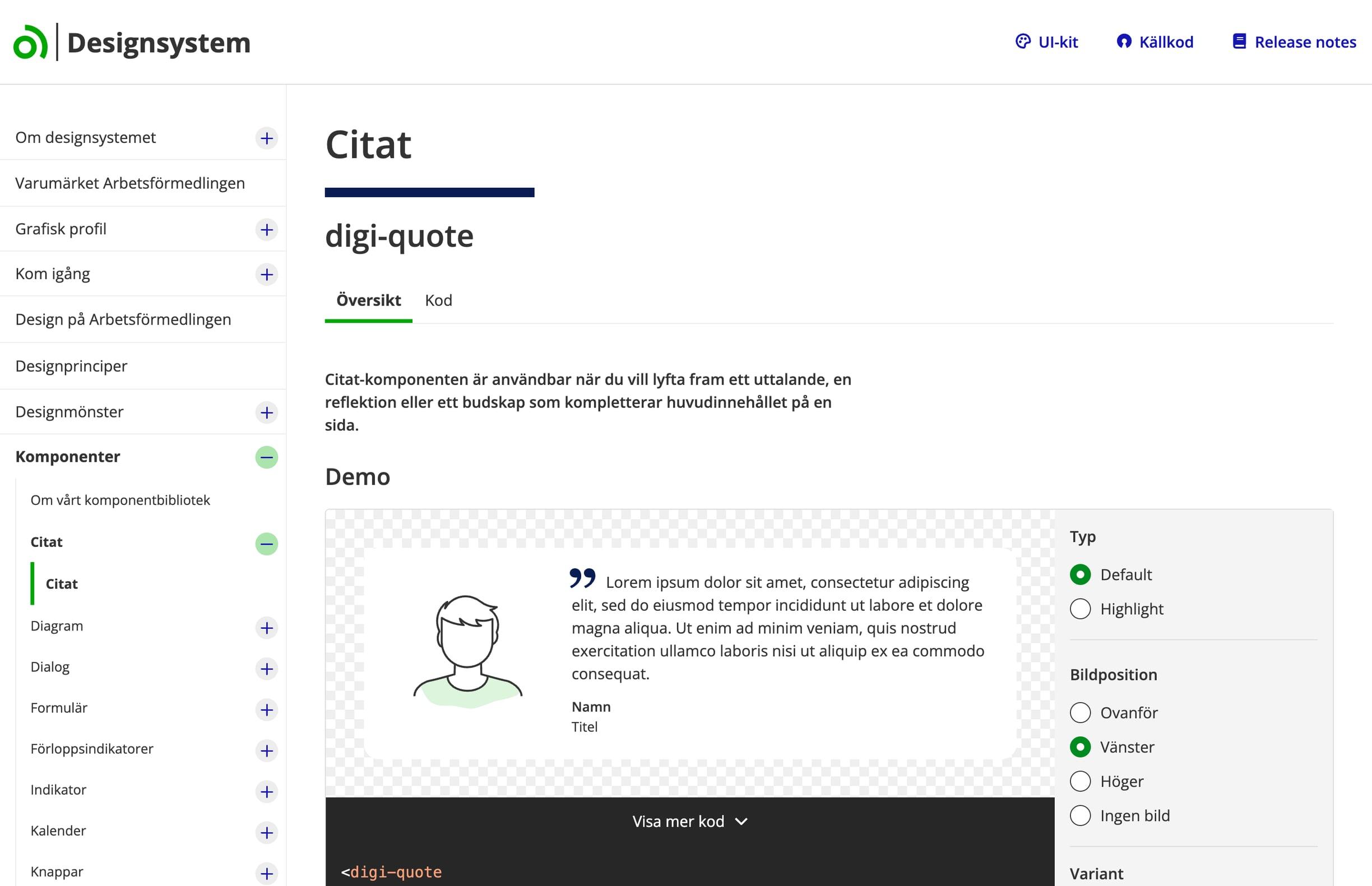
About the design system

The design system, Digi, is public. The components are web components with packages for Angular and React, and the guideline is that services use them first.
The starting point
Swedish public-sector services are covered by the law on accessibility of digital public services. A component in the design system has to work in every service that uses it, meet the accessibility requirements and follow the design in Figma.
Joel’s role
Joel built digi-quote alone, from component to documentation, and hand-built the Webbfärger page from the design in Figma. The team reviewed the code in pull requests before it was released.
Built by Joel
- The quote component digi-quote
- The component’s documentation page with a live demo
- The Webbfärger page, with the Af-18 colour set
With the team
- Design in Figma
- Code review in pull requests
- Review with an accessibility expert and a solutions architect
digi-quote
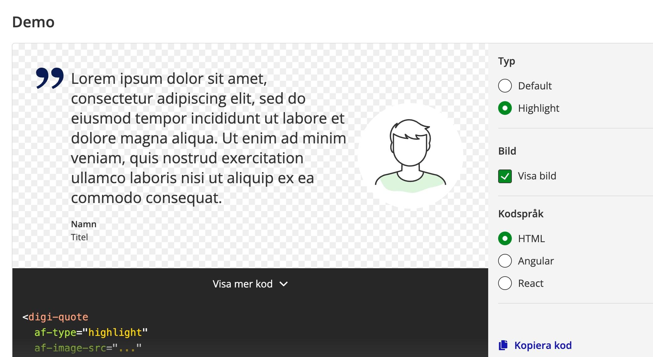
Two variants
default, in the body-text typeface with an optional background colour, and highlight, with larger text to make a quote stand out.
An image where it fits
The image can sit above, to the left or to the right of the quote, or be left out, and can be aligned within its frame.
Accessible from the start
A semantic blockquote, careful handling of alt text and background colours with sufficient contrast.
From code to documentation
A Stencil web component with packages for Angular and React, tests and a documentation page with a live demo.
Webbfärger
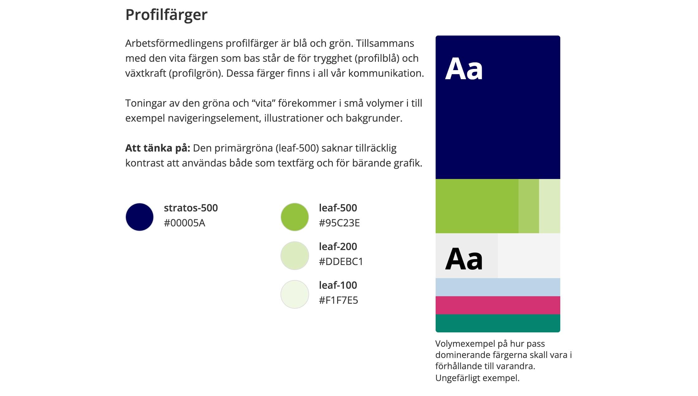
The whole palette on one page
Profile, complementary, neutral and functional colours, with token names and colour values.
Contrast you can check
Examples of passing and failing contrast ratios under WCAG, and how the colours look with colour blindness.
A system for names
Every colour has a name and a scale from 0 to 1000, which the design tokens are built on.
Built by hand
Joel built the page from the design in Figma, with the Af-18 colour set.
The technology
- Stencil
- Web Components
- Angular
- React
- Design tokens
- Figma
- WCAG
- The component was built as a Stencil web component, with packages for Angular and React.
- A semantic blockquote, alt text and background colours with sufficient contrast were part of it from the start.
- The colours on Webbfärger follow the design system’s tokens, with names and a scale from 0 to 1000.
Collaboration and delivery
The design was made in Figma. The team reviewed the code in pull requests before it was released in the design system. Accessibility was reviewed with an accessibility expert and a solutions architect.
Outcome
- digi-quote is part of the design system and publicly documented.
- Webbfärger is public, and Af-18 is the colour set Joel built.
Related services
It’s the same work Vindictive does for agencies and product teams: components that follow the design exactly, with accessibility and documentation from the start.
Have something ambitious in mind? Let’s build it.
Buy a website package online today, or tell us about the software, app or partnership you’re planning.
Need a reliable development partner? Agency partnerships